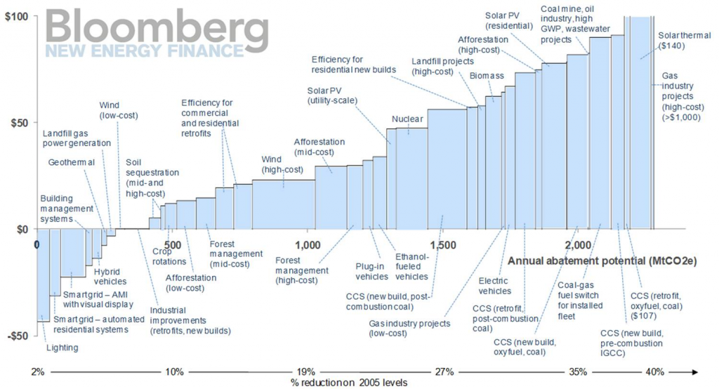
Most members of IEMA will undoubtedly have heard of Marginal Abatement Cost Curves, which are regularly used in climate change circles to help visualise complex data about carbon costs and emissions volumes. Below is an example of such a “curve” which illustrates the potential for different technologies to reduce greenhouse gas emissions in the USA.
If we look at the chart we can see that the technologies are ranked in ascending order of cost per tonne CO2equivalent (tCO2e)– that is to say that those projects that have the lowest cost (per tCO2e reduced) are on the left and those with the highest cost are on the right. Technologies below the line actually make a saving (a negative cost) over their lifetime – perhaps because they reduce energy consumption as well as carbon.
Bloomberg’s curve illustrates that “Lighting” is the most cost-effective technology, at a net saving of just under $50 per tonne CO2e abated on the left hand side, while way over to the right we have “Solar Thermal” and “Gas industry projects”, which have a net cost of over $100 per tonne over their lifetimes.
There is another very useful piece of information in this chart. The width of each of the bars illustrates the total potential CO2e saving per year for each technology. Thus a wide bar represents a large emissions reduction compared to a narrow bar, with “Wind (high costs)”, towards the middle of the chart, delivering the largest CO2 abatement potential in reduction terms. Because the projects are ranked side by side, the horizontal axis actually shows the cumulative emissions reductions for all the preceding technologies per year.
Taking both these factors into account, savings and cumulative emissions reductions, we can see that this MACC demonstrates that we can get to just under 280 MtCO2e reduction with technologies that break-even or have a net saving (up to and including “Landfill gas”). After “Landfill gas”, each subsequent project has a cost for each tonne of CO2e it abates. If we were to introduce a price of carbon of, say $50 per tonne, then all those technologies to the left of “Nuclear” (costing just under $50 per tonne) towards the middle of the chart would become financially viable, as they’re cheaper (from a whole life perspective) than paying a carbon price. Looking at the horizontal axis this shows a cumulative total of just under 1,500 MtCO2e potential emissions reduction, 1,200 MtCO2e over and above the 280 MtCO2e achieved without a carbon price. Projects to the right of “Nuclear” are more expensive than the $50 carbon price per tonne of abatement – therefore the carbon price alone is not enough to make them financially attractive. This is why policymakers like MACC curves so much; it gives them an “at a glance” indication of the impact of various carbon price signals.
So now we know what MACC means: Marginal is the incremental quantity of CO2e reduction or Abatement which can be achieved for a given Cost, which is shown in a graph or Curve.
Creating each entry in a MACC involves a number of steps. First of all you need to determine the lifetime of the technology or project and then calculate the cost/saving of the technology for each year it is in operation. These annual costs/savings need to be discounted to the Net Present Value (NPVs). Discounting reflects the fact that that cost or savings today are more valuable than a similar cost or saving in the distant future.
The discount rate that is used varies, but reasonable choices would be around 9% for a private business or as low as 3% for a government agency. The choice here is important as low discount rates increase the long-term net benefit of a technology compared to its initial cost and so brings more technologies under the horizontal line of the MACC. The discount rate used should be appropriate to the entity developing the MACC, if they’re the ones who will need to finance the projects.
The $/tCO2e is obtained by dividing the sum of the total NPV of the project/technology by the total CO2e abated by the project, which is not discounted. The spreadsheet you might construct would look something like the table below, and it is the last two columns that you would use in the graph, with the data sorted by the Marginal Abatement Cost column in ascending order.
| Project | Lifetime Net Present Value (£) | Annual CO2e reduced (tonnes) | Cumulative Annual CO2e reduced (tonnes) | Marginal Abatement Cost (£/tonne) |
| Lighting Project |
-500,000 |
25,000 |
25,000 |
-20 |
| Insulation Project |
-7,400,000 |
740,000 |
765,000 |
-10 |
| Wind Project |
400,000 |
25,000 |
790,000 |
16 |
Calculating NPVs from a series of annual costs is relatively easy with the Excel function NPV(). However, creating the actual MACC chart itself is quite convoluted as Excel does not have the ability to draw variable-width bar charts. There are a number of techniques available to do this and if you look at the links at the end of this article you can find some webpages where you can download a couple of working spreadsheets.
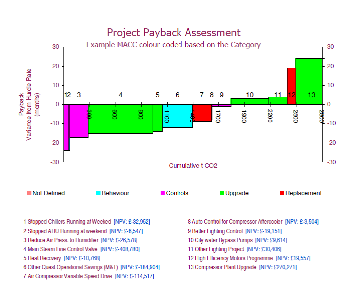
We have seen that MACCs can illustrate technologies and projects that give a positive financial return, however MACCs often don’t actually work in the real world of investment decisions. This is because projects are shown as feasible if they have a net saving over their lifetime, while many organisations actually are looking at a return in a fixed number of years (called the payback). So I have begun to present baskets of projects using a MACC-type approach, but with payback (not carbon cost) forming the vertical axis, and with cumulative CO2e still on the horizontal axis. An example is shown below.
To construct this graph I have calculated the simple payback of the project in months (i.e. the costs divided by the savings, multiplied by 12). Then, assuming that the organisation has a 2 year (24 month) payback requirement for projects, I subtract 24 from the actual payback of the project so that projects below the 24 month target are shown below the horizontal x-axis while those with a greater payback are above. We can see from the graph above that about 1,800 tCO2e can be reduced by projects which meet the payback criteria, and if the payback hurdle was raised from 24 months to 30 months, we should also get approval for projects 10 and 11 that deliver an additional 500+ tCO2e saving per year.
Note that in this last example I have used payback. I generally don’t favour this measure as it puts energy efficiency projects apart from other business investments, which are usually measured using their Internal Rate of Return (IRR). The good news is that it is possible to create a MACC in the same fashion using variance from target IRR and thus avoid using payback.
There are other ways that MACC presentations can be used, extending beyond the analysis of carbon, for example I have created MACCs with cumulative kWh electricity on the horizontal axis and discounted $/kWh on the vertical, which is entirely analogous to the carbon analysis.
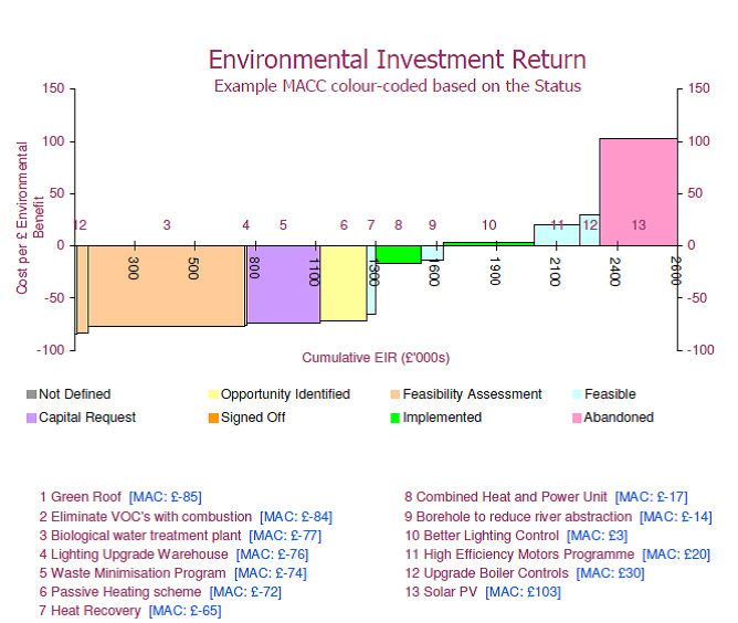
There are other approaches which can factor multiple environmental benefits rather than just carbon or just electricity. One example that I have used successfully is the idea of an Environmental Investment Return (EIR). This takes a number of environmental impacts of a project (say water use, CO2e, NOx, VOCs, etc.) expressed in financial terms and compares the sum of the environmental benefit with the discounted cost of the project.
It is important when using multiple factors to select equivalent costs, so as not to favour one factor over another. These environmental costs are usually either “market” prices, as in the cost of carbon allowances, or they are obtained from academic studies of the health and social impacts of pollution, etc. An interesting aspect here is that any given project might not have universal benefits, increasing one factor while decreasing another and so, by using a financial measure, the overall net impact of the project can be obtained.
In this approach, the equivalent of the Marginal Abatement Cost is the environmental benefit divided by the NPV of the project so that those projects that have the greatest positive environmental impact per £ spend appear on the left, as in the MACC, while the size of the environmental benefit is shown on the horizontal axis. I suspect that as the pricing of “externalities” becomes more commonplace and organisations look to understand and differentiate options for capital expenditure, this type of analysis will be increasingly more common.
So we have seen that the MACC is a powerful way of comparing a range of different investment choices. This comparison can be enhanced by using colour to categorise different aspects of the projects, such as status, as shown in the last figure. While MACCs are usually employed for assessing carbon, it is quite feasible to use the same techniques to compare other environmental factors, and help inform decision-making whether for investment choice or for pricing of externalities. Given the powerful presentational benefits on offers, MACCs should be part of every environmentalist’s communications tool kit, and it is well worth investing effort in understanding how to construct them.
About the MACC Charts
Please note that the charts illustrated were all created with MACC Builder Pro, which is an Excel Tool for creating professional MACC Charts. Further details can be found on this web-site.
Publication Details
This article was published in The Environmentalist magazine in March 2011. This is the house journal of the Institute of Environmental Management and Assurance (IEMA).
Follow the following link for a copy of the article.


0 Comments